Websites with great design are able to make a more stable and effective connection with their visitors. So if your website already has an attractive and functional design, the chances are high that your customer conversion rates are going to grow. By all means, high-quality emotional web design has a considerable impact on your business’ success. By creating and launching a site that efficiently communicates your brand message and represents your brand identity, you are simply taking one of the vital steps toward the overall success of your company.
In order to make your company site one of the most efficient tools for promoting your business and achieving higher sales, it is essential to ensure it is unique, reflects your brand mission and identity, and clearly communicates your message to your target audience. Perhaps the only natural way you can have a website like this is to get a hold of a professional web design agency that will do all the work for you. Don’t worry, there are many web agencies out there today, so you will have no issue finding the one that will be able to take care of your website within the set budget while fulfilling all of your needs. If you make the right choice and will be involved in the project as an intelligent customer, the results are going to be astounding and your conversion rates will skyrocket. See examples at bootcamp.uxdesign.cc.
But the most important thing here is that you will be able to create an emotional connection with your audience. Read on to find out how you can achieve the best results possible.
Define The Branding Elements

Whether in a positive or negative sense, what elements in your design will decide the emotional impression on your site and have on your audience. Including:
- The Logo – Does it mirror your brand. Ask yourself if the entire website reflects the overall characteristics of the logotype and brand?
- The Color – Does the site’s color scheme mirror the brand and firm?
- The Typography – How well does the arrangement of the text do it visually interesting to your audience? Elements that must be considered should include size, typefaces, length of the line, and spacing of the line.
- The Layout – Do you have a lot of white space on your website?
- Photography – Have you gone over your photos? Do they correctly describe the appearance you want for your brand?
- Graphics – If you need graphics on your site, do they represent your brand in the right light?
- Content – The content on your site is critical. Be sure it’s to the point, explicit, and uncluttered. Keep in mind, less is more!
Develop a Design Concept and Test it with a Focus Group

Once you have developed your branding components, it’s important to get feedback about your branding or your idea for the website design from others and your employees before leaping into your web designing. Check here to see more designs from online. What may look good to you might not get the emotional impact you wanted from your audience. If you are an international business, be sure to test it with people in different regions, worldwide, to ensure it will work well in those areas. Ask your marketing department or HR to test out your ideas with employees using contests, polls, or other activities. If you are re-designing, it’s a good idea to get your employees’ feedback.
Make Sure Your Website Design is Ready for the Future

Make sure to choose your font and typeface carefully and stay far away from fads or super trendy styles. As an example, The Gap decided to change its logo, much to the chagrin of their customers. They needed to go back to the drawing board and remove some elements that would become very outdated very quickly. They also removed the new logo after many negative responses flew in the door. Take this as a learning curve. You must think ahead before taking on a major overhaul of your site and/or business. Continue to read and find out if you have a good logo for the future and a site that will continue to have emotional appeal to your audience.
If you have a good design, keep it because, in the long run, you are going to get what you are looking for.
- Invest in your design and stick to it.
- Stay involved in the market, along with the latest trends but stay clear of fads.
- Research your competition but do not copy them. Be yourself!
- For best results, do not overdo anything.
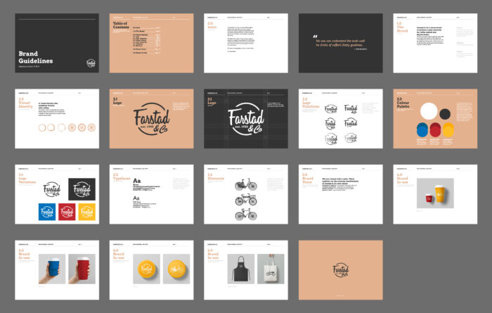
Create a Style Guide

Documenting your brand is very important if you want to remain consistent across your site and other platforms. The voice, tone, and personality of your brand are essential to keep your messaging understandable. Your fonts, size, and the amount of white space seen around your logo and website should be documented and examined to ensure it’s not overboard. In order to work toward an emotional connection with your buyers, it’s important you create consistent branding all across your website and anywhere else you have your logo located.
Closing Thoughts
After doing all the preparations and determining your brand goals along with the best approach towards your target audience, it’s time to implement all of that into your website. You have shaped your brand identity together with your website design company and have put an emphasis on your audience’s values. This, in turn, helped you define your branding components and test various design concepts to make certain that they fit in with your target audience’s preferences. All of these things lead to one outcome – a strong, effective company website. Your company site is your brand’s reflection, so it must connect emotionally with your audience, channeling your brand image and business message, clearly representing the things you are trying to deliver to people.


